All cases
Harfi
A strong, timeless mark for Harfi.
- 01Briefing
- Harfi needed an identity that feels solid and trustworthy from the very first look: a recognisable mark that works just as well small on a business card as large on a letterhead, and a clear set of rules so everything stays consistent.
- 02Approach
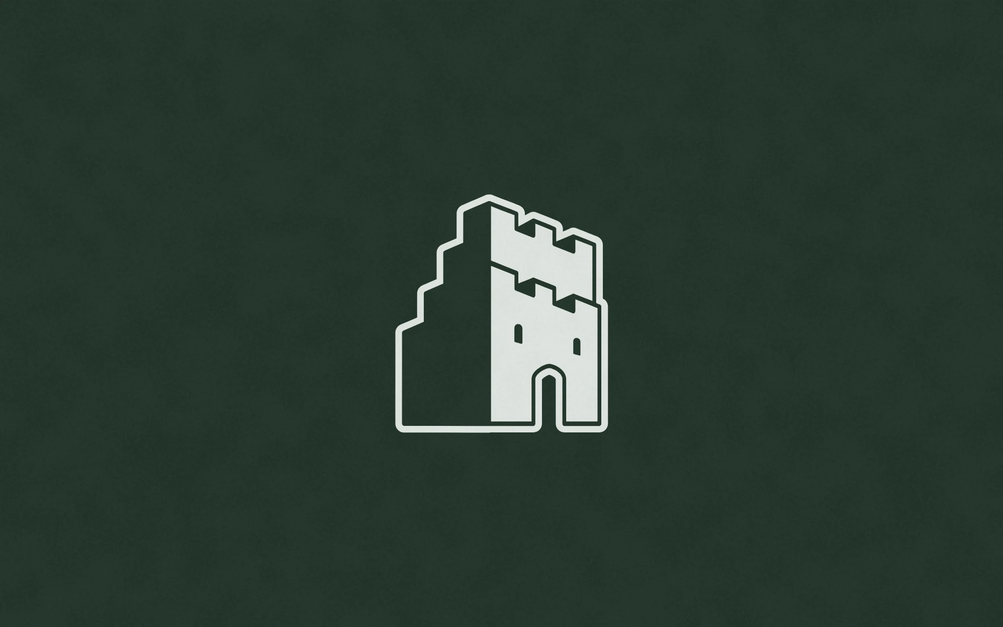
- I started on paper, sketching castle shapes until one simple silhouette stood out. That became a bold castle icon in deep green and white, which I rolled out over a business card and letterhead and captured in brand guidelines.
- Deliverables
- Logo · Stationery · Guidelines
- Tools
- Illustrator · InDesign
- Status
- Delivered
01Sketches
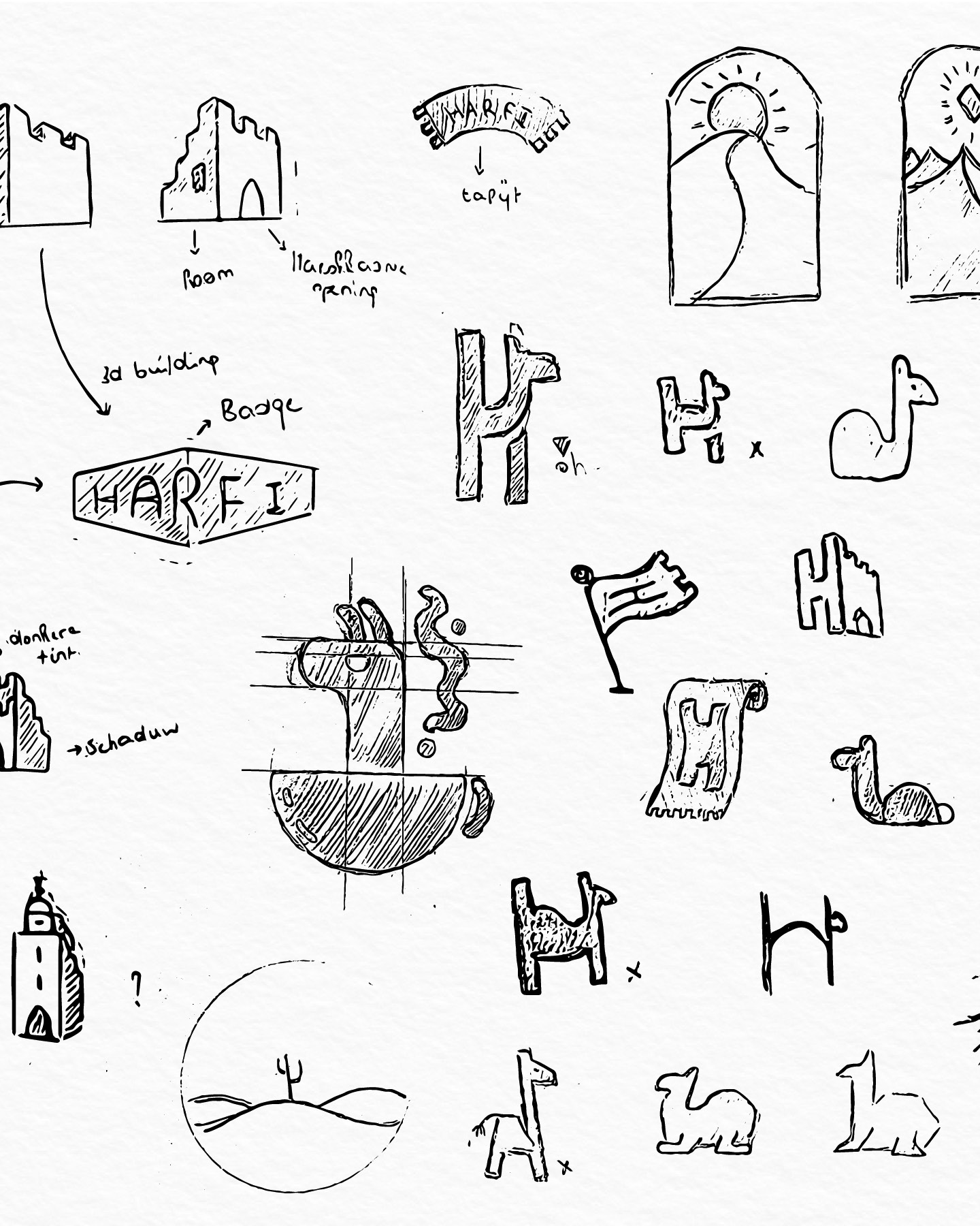
It started with pencil and paper: dozens of castle shapes, from detailed towers to a single outline, until the simplest silhouette said the most.
02Logo
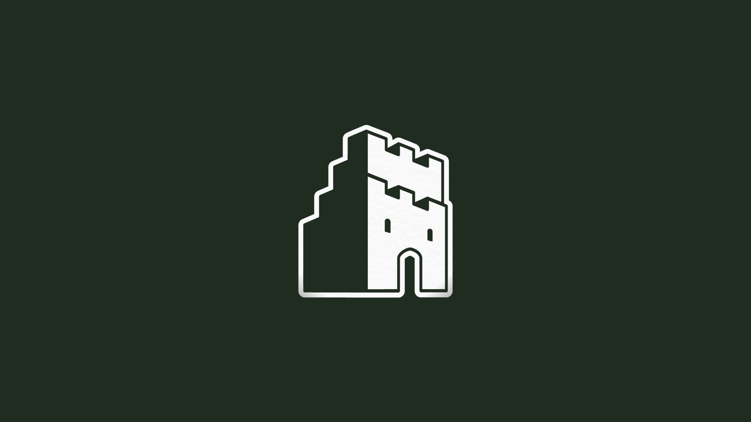
A castle built from clean, stepped lines: half light, half shadow. Strong and calm, in deep green and white.


03Business card
The castle on the front, the details on the back. Simple, with plenty of room to breathe.
04Letterhead & envelope
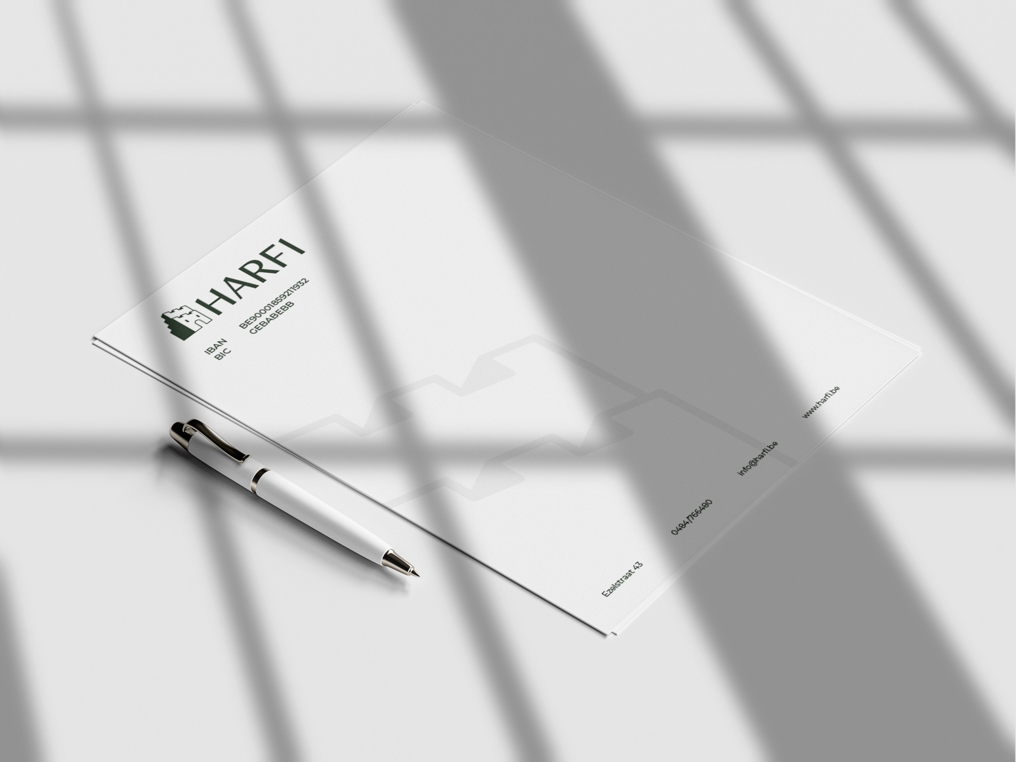
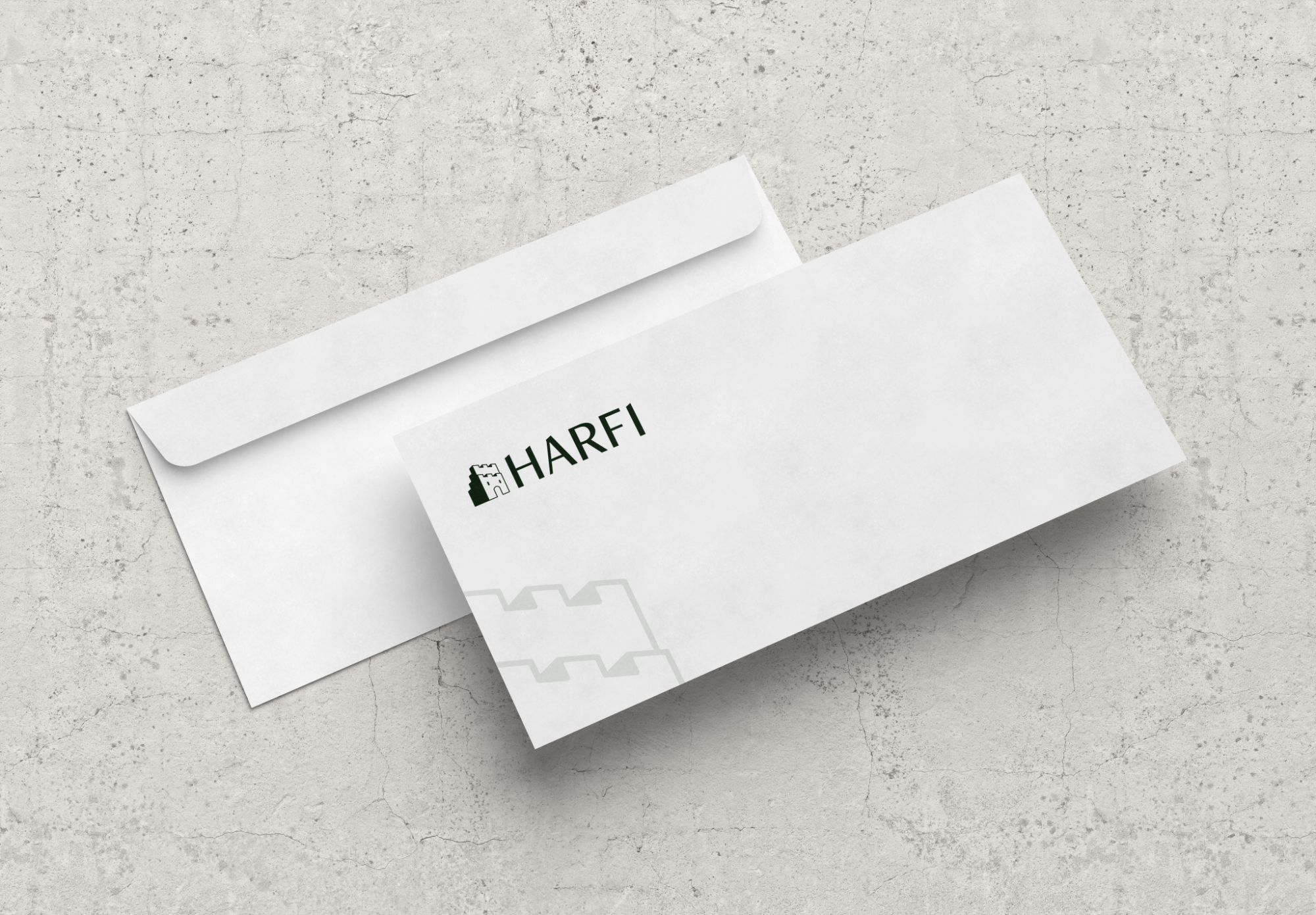
A letterhead and envelope in the same style, so every letter and quote looks like it comes from the same place.
05Brand guidelines
Everything in one document: how to use the logo, the colours, the type and the graphic elements, so the brand stays consistent long after delivery. Flip through it below.